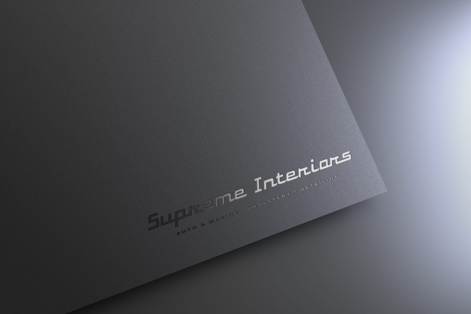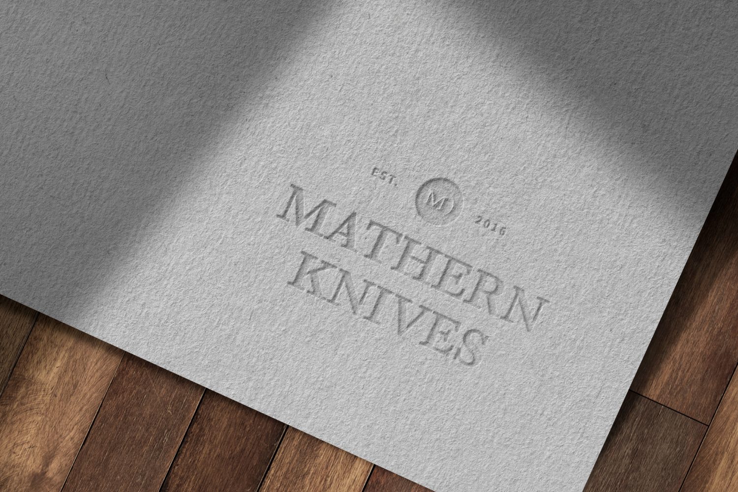
Three concepts, one decision
What Native Design + Build received: three separate arguments for the same company, each printed on real stock. Not three weights of one logo.
 Design + Build · Northern Colorado
Native chose 03. Everything that follows — the system, the foil, the mug on the desk — came off that one decision.
One route becomes a system
A logo on its own is a drawing. What a business can actually run on is the sheet around it: the reversed lockup for dark backgrounds, the one-colour mark for a stamp, the minimum sizes, the clear space, and every file your printer and embroiderer will ask for.
You own all of it. If you ever hand the brand to someone else, they have what they need on day one.
Then it has to be made
Foil needs different artwork than thread. A die needs depth. A patch needs a script thick enough to stitch. We prepare each piece for the process that makes it, and we talk to the vendor ourselves.
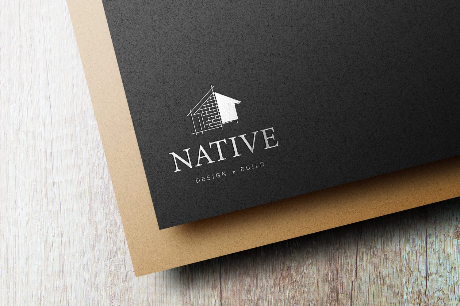
Business card
- Method
- Silver foil stamp
- Stock
- 32pt charcoal duplex
- Finish
- Soft-touch matte
- Detail
- Drafting grid held at 0.4pt
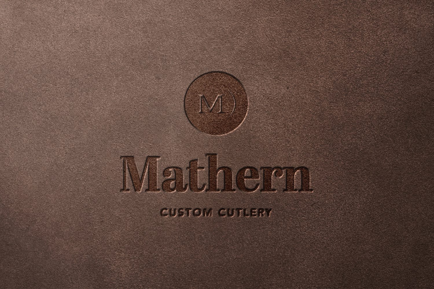
Sheath stamp
- Method
- Blind deboss, heated die
- Substrate
- Vegetable-tanned suede
- Depth
- 0.6 mm, no ink
- Detail
- Monogram ring redrawn for depth
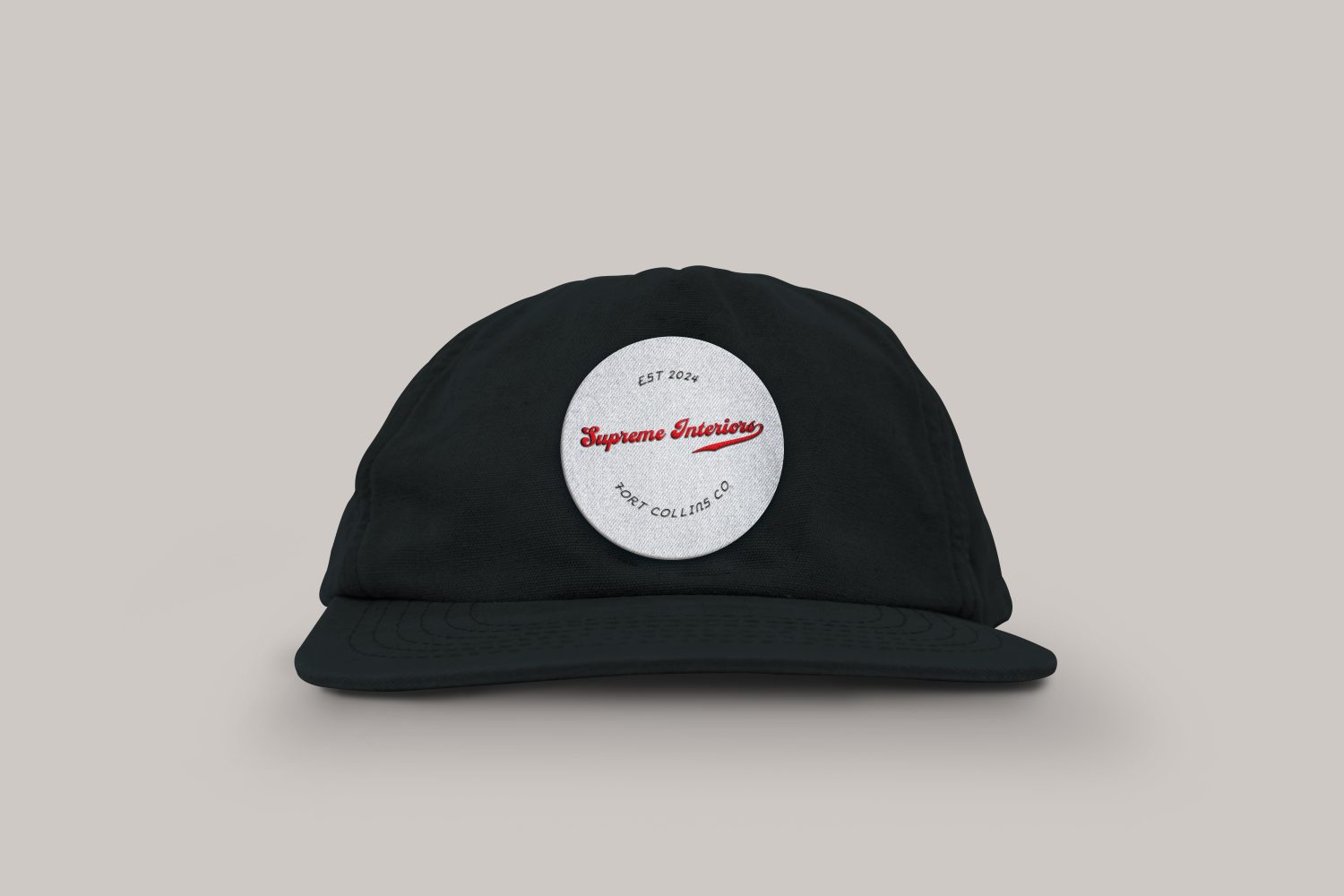
Patch cap
- Method
- 3-colour flat embroidery
- Backing
- Woven twill patch, merrowed edge
- Size
- 2.5 in circle
- Detail
- Script thickened for stitch
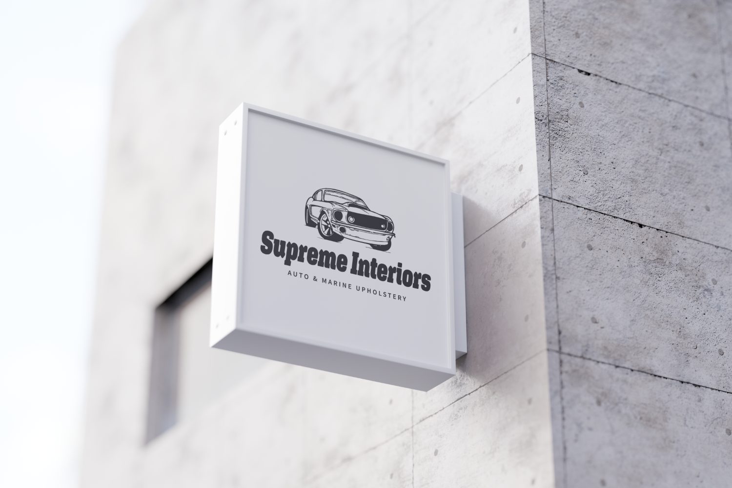
Out in the world, in real light
A mark that only works on a white artboard is not finished. These are the same identities on a storefront, a desk, a window, and a press sheet.
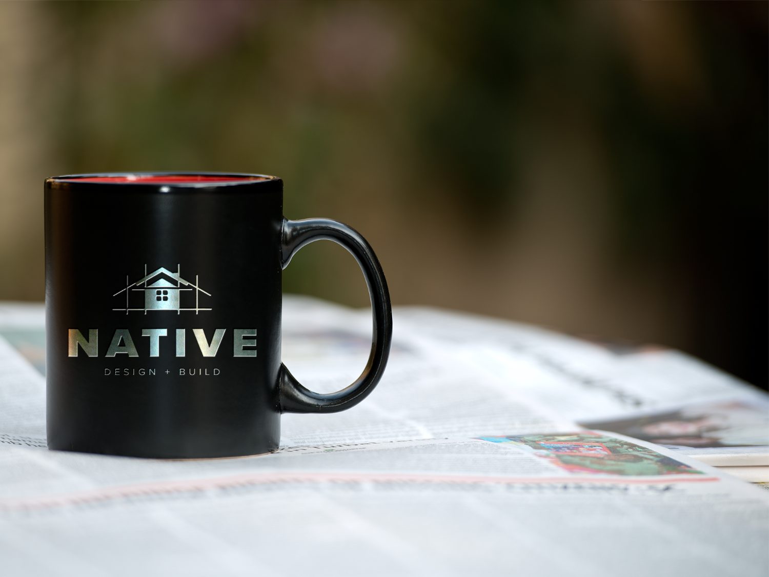
Built to outlive the trend
Before a mark ships it has to pass four states: full lockup, one colour, reversed out of dark ink, and 22 pixels wide. A logo that only holds up in the first one is a picture, not an identity. If it needs a gradient to work, it was never a logo.
Three distinct routes, not three versions of the same idea. Each one is a different argument about what the business is, presented on real stock so you can judge it the way your customers will see it. We recommend one, and we say why.
We refine the chosen route, then build out the system around it: lockups and clear-space rules, colour and type, and the files your printer, embroiderer, and sign shop each need. You own all of it.
We design and prepare the artwork, then work directly with your vendors so what arrives matches what you approved. Vehicle wraps, blade signs, embroidered caps, letterhead, decals — all of it comes off the same system.
Often that is the right call. If the mark has equity with your customers, we keep what people recognise and fix what is failing: legibility at small sizes, colour that does not print, missing files, inconsistent use.
Getting the brand in front of people ready to buy: paid search and local ads, social, retargeting, and increasingly placements inside AI assistants. Same team, so the ads look like the brand and point at pages built to convert.
Yes. Vector originals, every colourway, print and screen formats, and the fonts you are licensed for. If you ever work with another agency, they get what they need on day one.